TYPOPHILIA : CONTEMPORARY
FORM
USING SHAPES
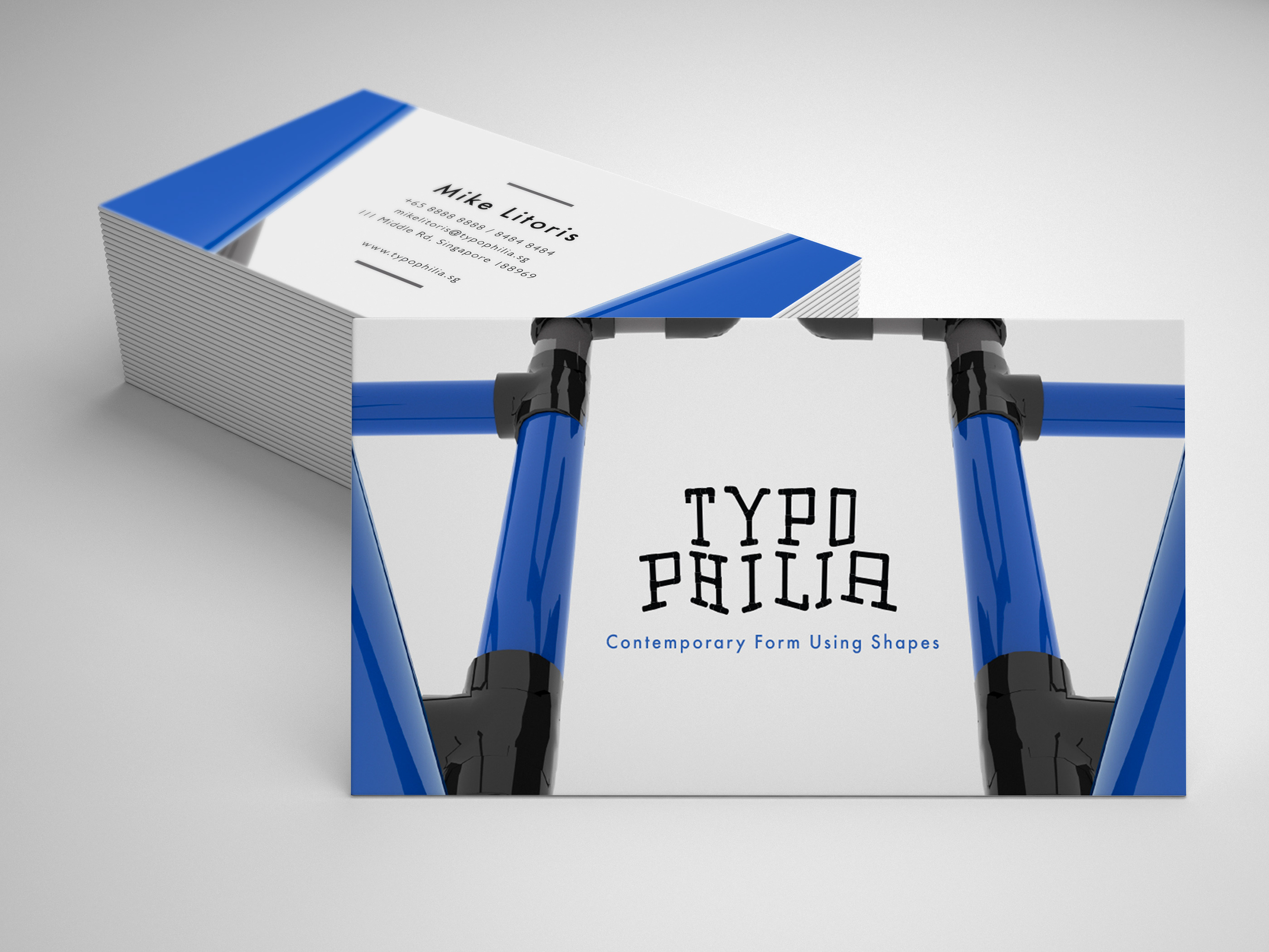
Typophilia is a typography festival brief that was given to me by the school. The concept of it was to create a festival that is open to more audiences not just creatives thus when curating and creating the project, I chose something that is common and relatable to a wider audience by using pipes and fonts that are more neutral to people.
By using pipes, it shows how people are connected to one another and by being connected to one another, we build a stable foundation whereby t hat is what the whole event is about, which is to learn from one another but also be able to detach and latch to different 'pipes' which also makes everyone unique, but able to connect anywhere. Since the type treatment for the words itself are big, i used a neutral typeface for the contents and such so that it is easily readable by the public and looks more inviting towards people who are not in the creative industry.